- Above the Fold: Understanding the Principles of Successful Web Site De
- Adapting to Web Standards
- Art of Non-Conformity
- Art of Readable Code
- Art of SEO
- Back to the User
- Beginning PHP6, Apache, MySQL Web Development
- Book Notes
- Books to Read
- Bored and Brilliant
- Born For This
- Choosing A Vocation
- Complete E-Commerce Book
- Content Inc
- Core PHP Programming
- CRM Fundamentals
- CSS Text
- Dealing with Difficult People
- Defensive Design for the Web
- Deliver First Class Web sites
- Design for Hackers: Reverse-Engineering Beauty
- Designing Web Interfaces
- Designing Web sites that Work: Usability for the Web
- Designing with Progressive Enhancement
- Developing Large Web Applications
- Developing with Web Standards
- Economics of Software Quality
- Effortless commerce with php and MySQL
- Epic Content Marketing
- Extending Bootstrap
- Foundation Version Control for Web Developers
- Guerrilla Marketing for a Bulletproof Career
- HACKING EXPOSED WEB APPLICATIONS, 3rd Edition
- Hacking Web Apps
- Happiness At Work
- Implementing Responsive Design
- Inmates Are Running the Asylum
- Instant LESS CSS Preprocessor How-to
- jQuery Pocket Reference
- Letting Go of the Words
- Lost and Found: A Painfully Honest Field Guide to the Startup World
- Making Every Meeting Matter
- Manage Your Day to Day
- Marketing to Millenials
- Mobile First
- Monster Loyalty
- More Eric Meye on CSS
- Official Ubuntu Book
- Organized Home
- Pay Me… Or Else!
- Perennial Seller
- Pet Food Nation
- PHP 5 E commerce Development
- PHP In a NutShell
- PHP Refactoring
- PHP5 and MySQL Bible
- PHP5 CMS Framework Development
- PHP5 Power Programming
- Preventing Web Attacks with Apache
- Pro PHP and jQuery
- Professional LAMP
- Purple Cow: Transform Your Business
- Responsive Web Design with HTML and CSS3
- Responsive Web Design with HTML5 and CSS3
- Rules of Thumb
- Saleable Software
- Search Engine Optimization Secrets
- Securing PHP Web Applications
- Serving Online Customers
- Simple and Usable Web, Mobile and Interaction Design
- Smart Organizing
- Smashing UX Design: Foundations for Designing Online User Experiences
- Studies in History and Philosophy of Science
- Talent is Not Enough
- The 10x Rule
- The Benefits of Working with Git In Your Software Projects
- The Clean Coder
- The Herbal Handbook for Home & Health
- The Life-changing Magic of Tidying up
- The Modern Web
- Think First
- This Is Marketing
- Traction
- Version Control with Git, 2nd Edition
- Web Analytics 2.0: The Art of Online Accountability and Science of Cus
- Web Site Usability: A Designer's Guide
- Web Word Wizardry
- Web Word Wizardy
- Website Owner’s Manual
- Whats Stopping Me
- Work for Money, Design for Love
- Your Google® Game Plan for Success: Increasing Your Web Presence with
- Checklists I Have Collected or Created
- Crafts To Do
- Database and Data Relations Checklist
- Ecommerce Website Checklist
- Learning Stuff From Blogs
- My Front End UI Checklist
- New Client Needs Analysis
- Newsletters I Read
- Puzzles
- Style Guides
- User Review Questions
- Web Designer's SEO Checklist
- Web site Review
- Website Code Checklist
- Website Final Approval Form
- Writing Content For Your Website
- Writing Styleguide
- Writing Tips
- 7 essentialls of graphic design
- Accidental Creative
- Choosing the right color for your logo
- CMS Design
- Communicating Design: Developing Web Site Documentation for Design and
- Designing for Web Performance
- Eat That Frog
- Elements of User Experience
- Flexible Web Design
- Forms that Work: Designing Web Forms for Usability
- Homepage Usability
- Responsive Web Design
- Seductive Interaction Design: Creating Playful, Fun, and Effective Use
- Strategic Web Designer
- Submit Now: Designing Persuasive Web sites
- The Zen of CSS Design
- Complete Book of Potatoes
- Creating Custom Soil Mixes for Healthy, Happy Plants
- Edible Forest Garden
- Garden Design
- Gardening Tips and Tricks
- Gardens and History
- Herbs
- Houseplants
- Light Candle Levels
- My Garden
- My Garden To Plant
- Organic Fertilizers
- Organic Gardening in Alberta
- Plant Nurseries
- Plant Suggestions
- Planting Tips and Ideas
- Root Cellaring
- Things I Planted in My Yard
- Way We Garden Now
- Weed Decoder
- 101 Organic Gardening Hacks
- 2015 Herbal Almanac
- Beautiful No-Mow Lawns
- Beginner's Guide to Heirloom Vegetables
- Best of Lois Hole
- Design in Nature
- Eradicate Invasive Plants
- Gardening Books to Read
- Gardens West
- Grow Organic
- Grow Your own Herbs
- Guerilla Gardening
- Heirloom Life Gardener
- Hellstrip Gardening
- Indoor Gardening: The Organic Way
- Landscaping with Fruits and Vegetables
- Real Gardens Grow Natives
- Seed Underground
- Small plot, high yield gardening
- Thrifty Gardening from the Ground Up
- Vegetables
- Veggie Garden Remix
- Weeds: In Defense of Nature's Most Unloved Plants
- What Grows Here
- Activities for Kids
- Animals In My Yard
- Baking & Cooking Tips
- Bertrand Russell
- Can I Get that on Sale?
- Cleaning Tips and Tricks
- Colour Palettes I Like
- Compound Time
- Cooking Tips
- Crafts
- Crafts for Kids
- Even More Quotes
- Household Tips
- Inspiration
- Interesting
- Interior Design
- Keywording & Tags
- Latin Phrases
- Laundry Tips
- Learn Something New
- Links, Information, and Cool Videos - Stuff for My Kids
- Music Websites for Parents and Kids
- My Miscellany
- Organizing
- Quotes
- Reading List
- Renovations
- Silly Sites
- Things that Make Me Laugh
- Videos to Watch
- Ways to Be Nice
- YouTube Hacks
- Bug Tracking Tool
- Business Tips
- Code Packages I Like on GitHub
- Content Management systems
- Creating Emails & Email Newsletters
- Games
- I Made A Framework
- Open Source
- Patterns, Textures and other media
- PHP Coding Standards
- Programming
- Project Verbs for to do lists
- Qualities of Creative Leaders
- Scalable Vector Graphics
- SEO
- Software Design
- The Shell, Scripts and Such
- Writing Instructions
- Accessibility
- CSS Frameworks
- CSS Reading List
- CSS Sticky Footer
- Design of Sites
- htaccess files
- HTML Tips and Tricks
- Javascript (and jQuery)
- Landing Page Tips
- Making Better Websites
- More Information on CSS
- MySQL and Databases
- Navigation
- Responsive Design
- Robots.txt File
- Security and Secure Websites
- SVG Images
- Types of Content
- UI and UX and Design
- Web Design and Development
- Web Design Tools
- Web Error Codes
- Website Testing Checklist
- Writing for the Web
- Writing Ideas for your website
- Animations and Interactions
- Being a Better Designer
- Bootstrap Resources
- Color in Web Design
- Colour
- CSS Preprocessors: Sass and Less
- CSS Tips Tricks
- Customer Centered Design Myths
- Design Systems
- Designing User Interfaces
- Font & Typographical Inspiration
- Fonts, Typography, Letters & Symbols
- Icon Sets
- Icons
- Logo Designs
- Photoshop Tips and Tricks
- Sketch
- UX and UI and Design Reading List
- Web Forms
- Well Designed
Tips
Fun with Shadows
1. To put a shadow on one side of your object:
box-shadow: 0 29px 5px -5px white;
Where the -5px is the spread and it puts the shadow on one site. When this spread value is positive, it creates an outline.
2. To get multiple outlines on an object, add multiple box-shadows.
Blur Backgrounds (behind modals)
main.de-emphasized {filter: blur(3px) contrast(.8) brightness(.8);}
See also - CSS Text Shadows
Creating Charts
Max's Chart is a simple way to create charts using PHP and css. http://www.phpf1.com/product/php-chart-script.html
Swap Image using jQuery and CSS
$(function() {
$(".hoverswap").hover(
function () {
$(this).attr("src", $(this).attr("src").replace(/.png/, "_over.png"));
},
function () {
$(this).attr("src", $(this).attr("src").replace(/_over.png/, ".png"));
}
);
});
Style numbers of an ordered list in different way than the content of each list item
ol {
font: italic 1em Georgia, Times, serif;
color: #999999;
}
ol p {
font: normal .8em Arial, Helvetica, sans-serif;
color: #000000;
}
Fixed Footer on the bottom of the page
Opaque Colours
Font Sizing
Wondering what to use: pixels, ems, rems, media queries. Use ems, here is why.
Best Text, no network requests:
body {
    color: #212121;
    font-family: "Helvetica Neue", "Calibri Light", Roboto, sans-serif;
    -webkit-font-smoothing: antialiased;
    -moz-osx-font-smoothing: grayscale;
    letter-spacing: 0.02em;
}
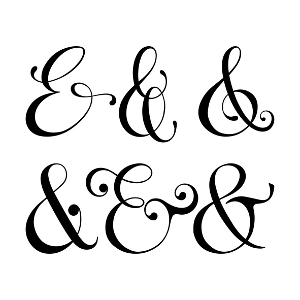
Styling Ampersands
@font-face {font-family: Ampersand; src: local('Baskerville'),local('Goudy Old Style'), local('Palatino'), local('Book Antiqua');unicode-range: U+26; }h1 {font-family: Ampersand, Helvetica, sans-serif;}
Style numbers of an ordered list in different way than the content of each list item.
ol {
font: italic 1em Georgia, Times, serif;
color: #999999;
}
ol p {
font: normal .8em Arial, Helvetica, sans-serif;
color: #000000;
}
Curved cutout corners, with radial gradients
background: #58a; background: radial-gradient(circle at top left, transparent 15px, #58a 0) top left, radial-gradient(circle at top right, transparent 15px, #58a 0) top right, radial-gradient(circle at bottom right, transparent 15px, #58a 0) bottom right, radial-gradient(circle at bottom left, transparent 15px, #58a 0) bottom left;background-size: 50% 50%; background-repeat: no-repeat;
Color Tint
img {
transition: .5s filter;
filter: sepia() saturate(4) hue-rotate(295deg);
}
img:hover, img:focus {
filter: none; }
Clear Floated Elements
The simplest way to clear a single (or series of) floated element(s) is to declare overflow:hidden on the parent element.
CSS Sorcery
a[href]{}
article[class]{}
section[id="sideBar"]{color: red}
Style all links that are fully qualified URLs, knowing that ^ means "starts with":
a[href^="http"]{}
Need to style a link to a ZIP or a PDF? Totally fine, too. Use the $ which means "ends with"
a[href$=".zip"]:after{content:"(zip)"}
Style an image based on one word existing in the alt attribute? Let's use the space substring selector:
img[alt~="Insurance"]{}
Style an image based on the name of the image file itself? Also doable, even if you're image is this-image-shot-april-2-2014.png. The | is a hyphen substring selector:
Em vs. Px
Start your CSS stylesheet with
Leading
Many designer fail to give the right importance to that feature and, as result, they may get “descenders” of a line overlapping “ascenders” of a lower one. Alternatively, if you put too much space between the rows, you will get a loose, hard to read text.
To avoid these issues, a good rule of thumb to start with is 140% of the font size.
For example: imagine your typeface dimension is 20pt, the right line-height is about 26-28pt.
This page contains information I gathered and thought were very useful. See more notes on design.
Just to let you know, this page was last updated Friday, Jul 24 26